Montreal’s Symbols & Other Quebec Curios
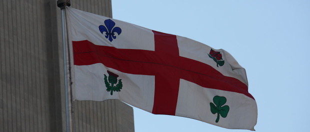
Long before Canada had its maple leaf flag, there was Montreal’s. At the same time as Maurice Duplessis was thinking of a provincial flag, the island of Montreal beat him to it and flew its flag on George V’s Silver Jubilee Day, May 6, 1939, about nine years before the fleurdelisé was officially launched. Yet the Montreal flag has an interesting precedent: it is nearly a carbon copy of the Montreal coat of arms, itself going back much further into the early 1800s.
Originally introduced in 1938, the coat of arms modelled after Mayor Jacques Viger’s original concept back in 1833. Viger’s original conception contained four symbols of what he believed made up Montreal’s four founding peoples, the beaver symbolised the French people and their original business here: the fur trade; a Lancastrian red rose for the English; a shamrock for the Irish (also a symbol of the Trinity); and the Scottish, symbolised by a thistle.

Montreal’s original coat of arms, as drawn by William Berczy, 1833. Source : Ville de Montréal. Gestion de documents et archives, BM99,S1,D1.
When the coat of arms got a long-awaited revamp, some notable changes from Viger’s original conception happened. The adoption of the French style of shield (instead of a round shield), and the changing of the saltire conception (the X-formation that divided the four symbols) to a cross seem the most obvious. The cross formation did double duty as a St. George’s Cross (the red cross that is equally integrated into the flag of Great Britain) as well as the Christian heritage and principles of the French-Canadian missionaries that came to Montreal. Maple leaves were added around the shield, an allusion to the harmony between the four peoples. Yet the new coat of arms now included the fleur de lys, the traditional symbol for the French royal house of Bourbon, replacing the beaver to stand for the French. The beaver is still there, sitting on the top of the shield, and the motto beneath the coat of arms remains the same since 1833: Concordia salus (“well-being through harmony”). The coat of arms hasn’t changed since.
In 1981, Mayor Jean Drapeau would commission the creation of a Montreal logo meant to be used for everyday events, reserving the coat of arms for formal occasions. His logo, meant to represent the ties Montrealers have to their city, can be seen just about anywhere, and has been only slightly modified in colour since its first appearance. In 2008, Greater Montreal would have a stab at creating their own logo, as well, to the tune of just scant 1.5 million dollars, which can only be described aptly in the current vernacular with one word: fail.


