Art Exhibit: Warhol Mania Small but Bright
Art lovers and amateurs flocked to the MMFA to see the colorful Kandinsky paintings, while next door a much smaller exhibition was taking place, dedicated to Pop artist Andy Warhol entitled Warhol Mania. Much smaller in size, this exhibition featured two rooms of posters and magazines by Warhol. As one of the museum’s discovery exhibitions, access is included in the price for visiting the museum collections and it’s worth taking time to see a lesser known body of work by the “poster-child” of pop art.
Warhol began his career doing illustrations for magazines including Harper’s Bazaar, Esquire, and McCalls. Several cases showcase his magazine designs – mostly line drawings of shoes and clothing coloured with bold, cheerful reds. These illustrations also speak to Warhol’s popularity as he eventually combined graphic arts with artistry, mass producing his art and transforming the rote and quotidian into art.
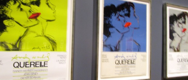
On one wall, the exhibition claims to feature all 52 posters of Warhol’s career. I didn’t have the sense that all 52 were there (and I have a hard time believing he only made 52 – so I question the accuracy of that wall blurb), but there was a varied selection. Warhol’s record covers/posters of a short-haired Arethra Franklin, the Beatles, and Michael Jackson hung on one wall. On another was collaborative work done with other pop artists. In particular, I noticed a group work by Keith Haring, Yoko Ono, and Roy Lichtentstein for Rain Dance, a UNICEF project. Posters advertised art shows and jazz festivals. There was a poster for the Sarajevo 1983 Winter Olympic games, and another for Rainer Werner Fassbinder’s 1982 film Querrelle. Finally, it was great to see posters he made for products, notably Perrier, and the Absolut Vodka bottle that kicked off the campaign of having artists design posters for the vodka brand. Warhol had suggested to the company that bars that sold the most Absolut Vodka could be rewarded with an original piece of art.
Warhol’s posters generally utilize the same format (though there are exceptions). He combines photographs that have been simplified in their colors. He added outlines in black, red, magenta, and other warm tones to trace the general shapes and features of the subject. Sometimes he let the outlines rest directly over the original photograph and other times he transposed them on the canvas. Then, he blocked in extra color and added words or lettering. Generally, though, Warhol sticks to a few colors (generally magenta, mauve, pink, red, purple, or orange), about three per poster along with black and white.
Warhol’s style is iconic and much copied. Warhol imitators are everywhere and as a result, his posters seem like historical documents more than art. Nonetheless, this charming exhibit is worth walking through to see Warhol’s development and the variety he could produce.
Andy Warhol Mania is on until March 15 at the Musee des Beaux Arts (Sherbrooke). $12. Under 30 free.


